ArchPulse — Visualizing Codebase Health at a Glance
Context / The Problem
As my projects have grown in size and complexity, I've run into a recurring and deeply frustrating problem: the emergence of "god components"—files that balloon in size and responsibility until they become nearly impossible to maintain. This isn't just a theoretical concern. In practice, it means that every bug fix becomes a game of whack-a-mole: patching one issue in a massive file inevitably causes regressions elsewhere, because logic is tangled and boundaries are unclear.
AI coding agents, for all their speed, tend to make this problem worse. They don't have the architectural context to know when a file is taking on too much, so they keep piling on. The result: technical debt accumulates invisibly, and the cost of change skyrockets.
I needed a way to make this debt visible—instantly, and at scale. Manually checking file sizes and responsibilities just isn't feasible for a modern codebase. I wanted a tool that would let me see, at a glance, where the architectural pain points were, and give both myself and my agents a clear roadmap for refactoring.
The Solution: ArchPulse
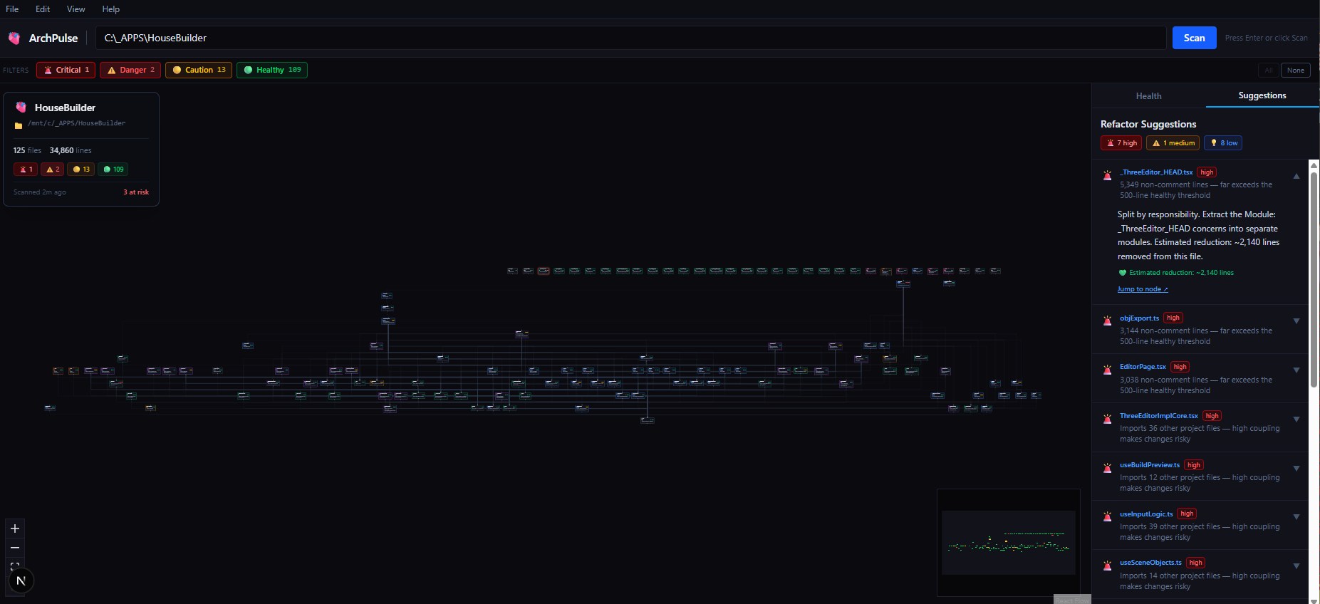
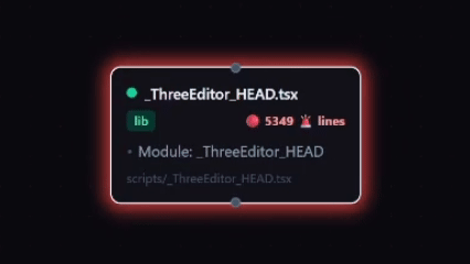
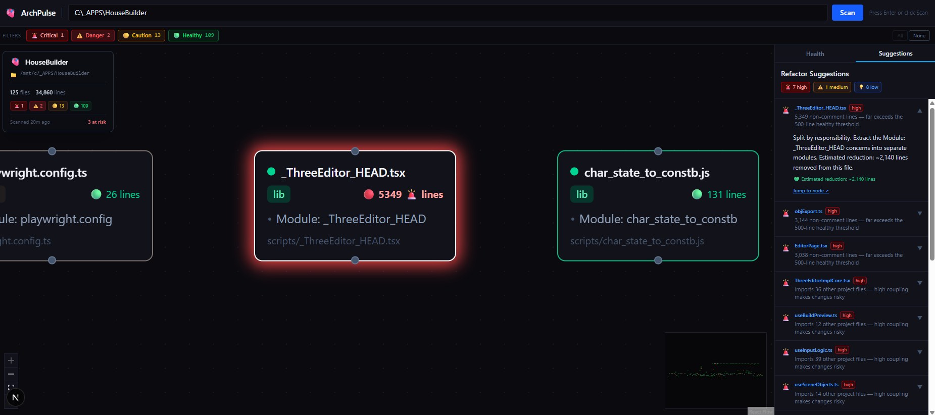
ArchPulse is my answer to this problem. It's a browser-based tool that visualizes any local codebase as an interactive node graph. Each file becomes a node, with directed arrows showing import relationships. The real power comes from the health indicators: nodes pulse and glow red as their line counts cross critical thresholds, making "god components" impossible to ignore.
Key features:
- Interactive node graph (React Flow + Dagre): pan, zoom, minimap, and auto-layout
- One node per file: shows file name, role, line count, and up to 4 responsibility bullets
- Directed edges: visualize import hierarchy and dependency flow
- Health color coding: green (healthy), yellow (caution), red (warning/danger/critical)
- Animated pulse: files over 1,000 lines pulse red; over 5,000 lines, they glow constantly
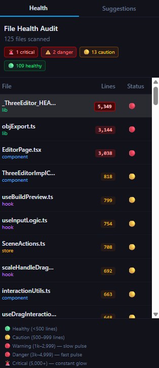
- Audit table: sortable breakdown of file health, line counts, and roles
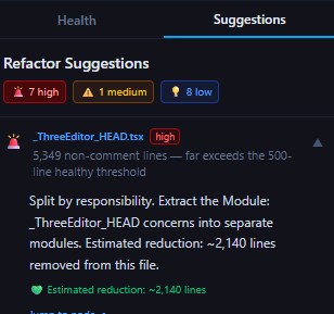
- Export: generate a JSON report with refactor suggestions for agent handoff
 ArchPulse Overview
 ArchPulse — God Component Red Glow
Technical Deep Dive
ArchPulse scans a local folder, parses all source files (.ts, .tsx, .js, .jsx), and builds a dependency graph by analyzing import statements. Each node is auto-classified by role (component, hook, store, etc.) using filename patterns and export analysis. The Dagre layout engine arranges nodes top-down, with entry points at the top and leaves at the bottom.
The most challenging part was designing the health animation system. I wanted the pulse to be both visually urgent and non-distracting, so I tuned the CSS keyframes to scale with line count. The audit table is powered by the same data model, letting me sort and filter for the worst offenders.
 ArchPulse Health Sidebar
 ArchPulse Refactor Suggestions
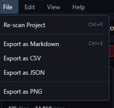 ArchPulse File Menu
 ArchPulse — Focus Mode
The Impact
The first time I ran ArchPulse on a large project, I immediately spotted three files with over 5,000 lines of code—true god components that had been hiding in plain sight. With the JSON export, I could hand off a precise refactor plan to an agent, who then broke up the files and reduced coupling across the codebase.
This tool has fundamentally changed how I approach architecture reviews. Instead of guessing or relying on intuition, I have a live radar for codebase health. It saves me hours of manual review, and gives both me and my agents a shared language for technical debt.
Summary
What it solves for me:
- Makes architectural debt visible and actionable
- Surfaces god components before they become blockers
- Enables targeted, data-driven refactoring
- Bridges the gap between human and AI understanding of codebase health
What I’ve learned:
- Visual feedback is a force multiplier for architectural awareness
- Automated health metrics drive better agent outcomes
- Investing in internal tooling pays off exponentially as projects scale